Next Gen Selling icon
Next Gen Selling icon
5 replies
Connor_Amazon
Hi @Seller_Iq8G0IA7I69uO
We put it there so sellers can test it out without disrupting their normal workflow. Think of it as a sneak peek.
The Next Gen selling page basically a cleaner, simpler way to manage your Amazon business. Instead of hunting through different tabs and menus, everything important is right there - your listings, inventory, orders, all that good stuff. You can actually customize it to show exactly what matters to you.
You can give it a try and don't worry, all your regular tools are still there in the main Seller Central area if you need them. I hope this answers your question.
Best,
Connor
Seller_J46Ruz3VzvWCV
I tried it (linked text). You can easily look because the URL is different than the current Seller central.
I don't care for it, but I hate change.
1. I find the text/layout to large
2. The slide bar on the right isn't obvious enough. It's the same color as the top section
3. The Account Switcher works better
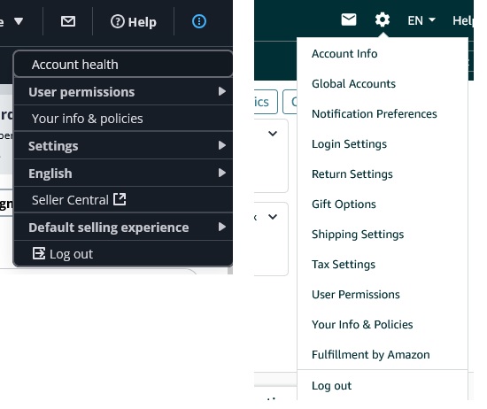
4. Account Info is much less obvious!! The "gear" wasn't real obvious, but the "3-dots" are even less obvious.

5. Several areas no longer have obvious links
Seller_Iq8G0IA7I69uO
I can delete or arrange my bookmarks in the Bookmarks Bar in the Next Gen Selling, but I cannot find out how to add new bookmarks.
I am able to go back to the old Seller Central and add bookmarks and they do appear in the Next Gen Selling version afterwards.
Just something I noticed. Probably not very important though.
